Summary: Latitude vs. Weather
The purpose of this project was to analyze how weather changes as you get closer to the equator. To accomplish this, we first pulled
data from the OpenWeatherMAP API to assemble a dataset of over 500 cities.
To find cities, we took a random sample of 1500 latitude and longitude coordinates around the globe. We then used the citypy package
to identify the city nearest to each of the randomly generated coordinates. After removing duplicate cities, we tested to see that we
had at least 500 cities in our dataframe. Having successfully generated a sample of cities worldwide, we used OpenWeaterMap API to pull
current weather information for each of those cities.
Because not all cities had weather information available, we tested the sample size again to ensure we had data for at least 500 cities.
We further tested to see if those cities were relatively well-spread geographically. The following two box plots show the distribution
of latitude and longitude in the final sample.
Distribution of Latitude and Longitude
Note that longitude values centered around 0 and were evenly spread, the latitudes found in the finished dataframe are skewed to the north
by 19.97 degrees. We saw the same effect each time we reran the sample. This is due to the fact that the northern hemisphere contains 68%
of the world's land mass (according to World Atlas).
To test this theory, we looked at the percentage of cities in the northern hemisphere and it was similar, at 68.47%. Therefore, we concluded that the skew represents the actual skew of location of landmass in the world and hence our sample was sufficient to continue analysis.
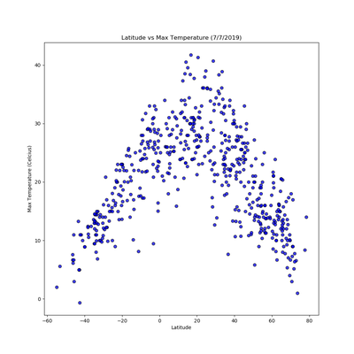
After assembling the dataset, we used Matplotlib to plot various aspects of the weather versus latitude. Factors we looked at included: temperature, cloudiness, wind speed, and humidity. This site provides the source data and visualizations created as part of the analysis as well as explanations and descriptions of any trends and correlations witnessed. You can see these visualizations and accompanying analysis by selecting comparisons across the top navigation bar or selecting any of the visualization thumbnails.